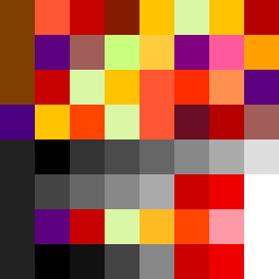
Square Project artwork
Rise vs Fall
panic vs control; order_vs_chaos; argument_grid; zigzag; spark against target; burned_edges; symmetrical_vs_broken; hole; joy_grief | abstract variation request 175; target batch count 200
- Grid
- 8 x 8
- Cells
- 64
- Colors
- 34
- Record
- c4e50e61
Artist Statement
The emotional tone reflects the tension between panic and control, encapsulated in contrasting colors. The warm palette of burnt orange and dark red conveys urgency and chaos, while charcoal and gold introduce a semblance of order and structure. The upper rows use a radial pattern to create a sense of growth and rise, while the lower rows employ a broken dot pattern to represent chaos and fragmentation. The main contrast occurs in the transition between warm and cool tones, echoing the shift from control to panic. The introduction of broken pixels adds imperfection, enhancing the chaotic theme inspired by the seed.