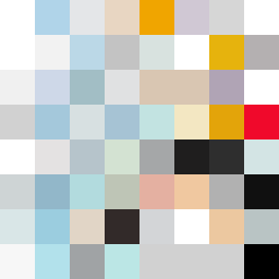
Square Project artwork
Exposure vs Shelter
vulnerability vs strength; light_vs_weight; mirror_broken; sweep; constellation against tide; closed_corners; thin_vs_heavy; horizon; safety_exposure | abstract variation request 328; target batch count 500
- Grid
- 8 x 8
- Cells
- 64
- Colors
- 54
- Record
- c4c8dc8f
Artist Statement
The emotional tone leans towards the struggle between protection and exposure. The chosen palette of clean white, ice blue, ink black, violet gray, and warning orange explores clarity against confusion. The main contrast occurs in the soft glow of the light colors versus the hard shadows created by darker tones, with an emphasis on vulnerability in the central area. The abstract pattern was influenced by the structural metaphor of a wall, using irregular placements to suggest the erosion of edges and corners while maintaining a stable center. This creates a dynamic interplay of strength and vulnerability, evoking both security and fragility.