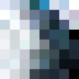
Square Project artwork
Fractured Harmony
vulnerability vs strength; light_vs_weight; mirror_broken; sweep; constellation against tide; closed_corners; thin_vs_heavy; horizon; safety_exposure | abstract variation request 157; target batch count 500
- Grid
- 8 x 8
- Cells
- 64
- Colors
- 60
- Record
- c41bf4c3
Artist Statement
This artwork embodies the tension between vulnerability and strength. The palette features soft hues of lavender gray, soft cyan, and moon white to represent fragility and lightness, contrasted with deeper tones of rain blue and muted plum to symbolize strength and grounding. The central area reflects vulnerability with a pale interior surrounded by dense, stronger color blocks exhibiting a crack-like pattern. The 'halo_void' layout emphasizes negative space, creating a contrast between the sparse center and the more populated edges, mirroring the contrast of exposed feelings against protective barriers.