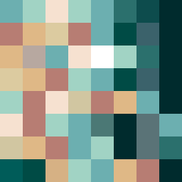
Square Project artwork
Exposure vs Shelter
safety vs exposure; pressure_vs_release; split_vertical; echo_right; braid against ripple; pressure_border; thin_vs_heavy; vessel; softness_severity | abstract variation request 436; target batch count 500
- Grid
- 8 x 8
- Cells
- 64
- Colors
- 18
- Record
- c3ad73c9
Artist Statement
This artwork explores the emotional tension between safety and exposure. The chosen palette of 'shelter_green', 'warm_brown', 'pale_skin', 'cold_white', and 'open_blue' reflects softness and severity, creating an atmosphere of dynamic contrast. The dominant use of warm browns aligns with the concept of safety, creating a comforting barrier, while the pale skin and cold white evoke a sense of exposure at the center. The central collision between light and dark colors represents the tension of transition, creating a rhythm that flows like waves of emotional pressure. The quiet channel layout adds an element of negative space that emphasizes vulnerability at the heart of the composition, while the rhythm of the pulse marks speaks to the ebb and flow of protective versus exposed sentiments.