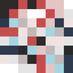
Square Project artwork
Pressure vs Release
quiet vs pressure; symmetry_vs_break; diagonal_argument; counterflow; shatter against tide; hard_edges; sharp_vs_soft; island; clarity_confusion | abstract variation request 91; target batch count 500
- Grid
- 8 x 8
- Cells
- 64
- Colors
- 11
- Record
- c3a88e40
Artist Statement
This composition embodies the tension between quiet and pressure, where deep, dark colors weigh heavily in one corner, signifying pressure, while lighter tones create a lattice of space and clarity across the opposite side. The palette—off-white for calmness, dust gray for neutrality, compressed red as an accent of intensity, dark navy as the weight of pressure, and faint peach to introduce a sense of softness—was chosen to contrast the emotion spectrum. The collision occurs diagonally, from the dark navy heavy edge to the lighter, quieter hues that dissolve into the space, creating an effect of layered emotions—intense in one area and softly fragmented in the other. The patterns overlap and interrupt each other, delivering a visual narrative of internal struggle and resolution.