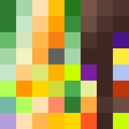
Square Project artwork
Balance in Contrast
vulnerability vs strength; exposure_vs_shelter; rising_signal; outside_inward; flood against spark; hard_edges; thin_vs_heavy; tiny_plus; connection_alienation | abstract variation request 417; target batch count 500
- Grid
- 8 x 8
- Cells
- 64
- Colors
- 40
- Record
- c368b78e
Artist Statement
This artwork embodies the emotional duality of vulnerability and strength through color contrast and spatial arrangements. The palette relies on rich greens and soft creams, suggesting a connection between nature's resilience and the delicate nuances of human emotion. The central diamond merges a vibrant green with softer cream tones, creating a strong visual anchor contrasted by an outer layer of deeper hues that introduces a sense of both protection and exposure. The collision is palpable where the bright center meets the darker edges, embodying the push-pull dynamic of vulnerability versus strength.