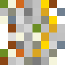
Square Project artwork
Exposure vs Shelter
vulnerability vs strength; symmetry_vs_break; cross_current; braid; flood against stack; pressure_border; fast_vs_slow; tiny_face; desire_emptiness | abstract variation request 198; target batch count 500
- Grid
- 8 x 8
- Cells
- 64
- Colors
- 16
- Record
- c2e9b671
Artist Statement
The emotional tone captures the duality of vulnerability and strength, creating a central dichotomy. The chosen palette of moss green, bone white, rust, stone gray, and small gold invokes resilience and fragility—moss green represents strength while bone white embodies vulnerability. The contrasting colors collide primarily at the center where pale colors meet denser ones, illustrating a tension between protection and exposure. The use of broken pixels introduces intentional disruptions, resonating with the theme of uneven strength and the fragility of the exposed. The overall composition evokes a narrative of pressure at the center with an escape towards the edges, achieving a balance between quiet fields and jarring interruptions.