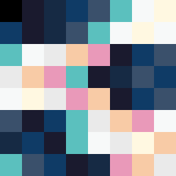
Square Project artwork
Contrast of Exposure
vulnerability vs strength; exposure_vs_shelter; rising_signal; outside_inward; flood against spark; hard_edges; thin_vs_heavy; tiny_plus; connection_alienation | abstract variation request 267; target batch count 500
- Grid
- 8 x 8
- Cells
- 64
- Colors
- 11
- Record
- c0766129
Artist Statement
This composition embodies the emotional tension between vulnerability and strength through a contrasting palette of dark and light. The main collision of color happens at the center, with soft yellows suggesting exposure fighting against the deep blues that symbolize shelter. The arrangement of broken dots leads to a sense of movement and rising hope amid the heavier tones, reflecting the theme of strength emerging from a vulnerable state. The chosen colors highlight the quiet spaces against dense clusters, creating a palpable tension between calm and pressure.