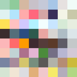
Square Project artwork
Exposure vs Shelter
safety vs exposure; pressure_vs_release; split_vertical; echo_right; braid against ripple; pressure_border; thin_vs_heavy; vessel; softness_severity | abstract variation request 445; target batch count 500
- Grid
- 8 x 8
- Cells
- 64
- Colors
- 64
- Record
- bfe10dfa
Artist Statement
The emotional tone oscillates between the vulnerability of exposure and the protective weight of safety, creating a tension that flows across the piece. The palette features colors symbolizing safety (shelter_green and warm_brown) and exposure (pale_skin, cold_white, and open_blue). The collision occurs centrally with brighter colors representing exposure meeting the darker tones of safety, creating a visual and emotional pulse. The two pulses of color play off one another, interrupted by broken pixels that hint at imperfections, emphasizing the theme of conflict between a fortified center and an open field.