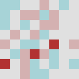
Square Project artwork
Exposed Fortitude
vulnerability vs strength; light_vs_weight; mirror_broken; sweep; constellation against tide; closed_corners; thin_vs_heavy; horizon; safety_exposure | abstract variation request 378; target batch count 500
- Grid
- 8 x 8
- Cells
- 64
- Colors
- 4
- Record
- bf7e0ada
Artist Statement
This artwork captures the emotional tension between vulnerability and strength. The palette blends soft and strong colors, where pale aqua represents vulnerability and deep ink blue signifies strength. The collision of dense patches of noise with lighter areas creates a composed chaos, reminiscent of strong walls with chinks that allow light to seep through. The deliberate 'broken_frame' layout emphasizes openings that invite interpretation. Contrast between the harsher alarm red and softer hues depicts interruptions in safety, while the arrangement of colors disrupts symmetry, embodying the challenge of exposure amidst fortitude.