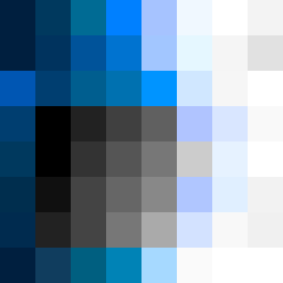
Square Project artwork
Pressure and Release
quiet vs pressure; symmetry_vs_break; diagonal_argument; counterflow; shatter against tide; hard_edges; sharp_vs_soft; island; clarity_confusion | abstract variation request 226; target batch count 500
- Grid
- 8 x 8
- Cells
- 64
- Colors
- 52
- Record
- bc0ff1fc
Artist Statement
The emotional tone reflects a collision between quiet and pressure, emphasizing the contrast through a dense core of dark colors that gradually shift into a soft palette at the edges. The color choices create tension: darker hues symbolize weight and pressure, while lighter shades introduce an element of release. The pattern embodies an erosion of symmetry, where a muted field of off-white and faint peach interacts with compressed red, representing a struggle between the overwhelming force of pressure and the calm of quiet spaces. The broken pixels serve as intentional disruptions, echoing shatters against the tide of the central flow that spirals outward.