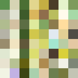
Square Project artwork
Exposure vs Shelter
vulnerability vs strength; light_vs_weight; mirror_broken; sweep; constellation against tide; closed_corners; thin_vs_heavy; horizon; safety_exposure | abstract variation request 56; target batch count 500
- Grid
- 8 x 8
- Cells
- 64
- Colors
- 64
- Record
- bb50ef3f
Artist Statement
The emotional tone captures the dynamic interplay between vulnerability and strength. The selected palette—ripe green, acid green, honey gold, deep olive, and cream—conveys a sense of natural contrast, with the lighter shades representing vulnerability and deeper tones symbolizing strength. The primary collision occurs in the center, where light and dark clash, creating a layered sense of pressure that mirrors the turmoil of conflict. The corner invasion layout emphasizes a diagonal spread of strength that clashes with the central exposure of vulnerability, symbolizing a struggle within a protective frame. The broken pixels disrupt the harmony, adding an element of imperfection and depth, echoing the complexities of safety and exposure.