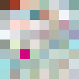
Square Project artwork
Exposure Shield
safety vs exposure; pressure_vs_release; split_vertical; echo_right; braid against ripple; pressure_border; thin_vs_heavy; vessel; softness_severity | abstract variation request 87; target batch count 500
- Grid
- 8 x 8
- Cells
- 64
- Colors
- 64
- Record
- bb281fb6
Artist Statement
This composition embodies the emotional tension between safety and exposure through a thoughtful use of color and contrasting patterns. The palette blends warm brown and shelter green, symbolizing protection, with cold white and open blue to evoke feelings of vulnerability. The dominant broken dots represent safety, creating a soft, warm barrier in the upper half, while the stripes in the lower half signify exposure, conveying a sense of openness and constant risk. The split vertical layout emphasizes the dichotomy, while the interplay between the patterns allows for a dynamic conversation between protection and vulnerability, mirroring the push and pull of these emotions. The presence of broken pixels adds an element of imperfection, suggesting fragility and the unpredictability of safety.