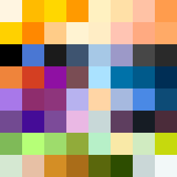
Square Project artwork
Exposure vs Shelter
vulnerability vs strength; light_vs_weight; mirror_broken; sweep; constellation against tide; closed_corners; thin_vs_heavy; horizon; safety_exposure | abstract variation request 169; target batch count 500
- Grid
- 8 x 8
- Cells
- 64
- Colors
- 64
- Record
- b9162afa
Artist Statement
The emotional tone reflects a tension between vulnerability and strength, embodied in contrasting colors and patterns. The chosen palette of yellow, orange, deep blue, and muted purple reflects warmth (strength) alongside coolness (vulnerability), creating a rich emotional landscape. The main contrast occurs in the corners, where a dense cluster of colors builds pressure while lighter, muted patches represent the exposed center. This structure evokes a sense of safety encroaching upon exposure, mirroring the seed's themes of shelter amidst vulnerability. The use of broken pixels reinforces the idea of imperfection, echoed in the jagged arrangement across the grid, creating an ongoing sense of tension and release.