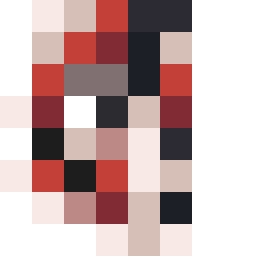
Square Project artwork
Pressure vs Release
quiet vs pressure; symmetry_vs_break; diagonal_argument; counterflow; shatter against tide; hard_edges; sharp_vs_soft; island; clarity_confusion | abstract variation request 369; target batch count 500
- Grid
- 8 x 8
- Cells
- 64
- Colors
- 11
- Record
- b659f98a
Artist Statement
The emotional tone reflects the juxtaposition of quietude against the weight of pressure. The palette balances soft tones like faint peach and off-white, which evoke a sense of calm and space, against heavier shades such as compressed red and dark navy, representing density and intensity. The main contrast occurs in the top-left corner, where denser clusters of red and navy collide with softer, quieter hues, suggesting a struggle between confinement and liberation. The layout of overfilled central density surrounded by looser patterns echoes the seed's themes of tension and resolution, highlighting the natural push and pull in our emotional landscape.