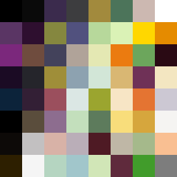
Square Project artwork
Exposure vs Shelter
vulnerability vs strength; symmetry_vs_break; cross_current; braid; flood against stack; pressure_border; fast_vs_slow; tiny_face; desire_emptiness | abstract variation request 500; target batch count 500
- Grid
- 8 x 8
- Cells
- 64
- Colors
- 63
- Record
- b4b5c573
Artist Statement
The emotional tone reflects a delicate balance between vulnerability and strength, illustrated through contrasting colors and pixel placements. The chosen palette of black, dark violet, soft gold, and pale green emphasizes the tension between dark themes of vulnerability and hopeful accents of strength. The main collision occurs in the center, where the interplay of soft gold and dark violet represents exposed vulnerabilities patched by elements of strength. This configuration echoes the seed's notion of protection and exposure, creating an abstract narrative of opposing emotions while maintaining a consistent flow in the arrangement.