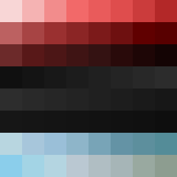
Square Project artwork
Exposure vs Shelter
vulnerability vs strength; light_vs_weight; mirror_broken; sweep; constellation against tide; closed_corners; thin_vs_heavy; horizon; safety_exposure | abstract variation request 234; target batch count 500
- Grid
- 8 x 8
- Cells
- 64
- Colors
- 61
- Record
- b0e377d9
Artist Statement
This composition contrasts the themes of vulnerability and strength using colors that reflect both soft and dense qualities. The top half embodies vulnerability with paler hues (soft breaks) signifying exposure, while the bottom half employs deeper tones (rooted contrast) representing strength. The broken pixels introduce a layer of imperfection, echoing the fragile relationship between the two emotions. Main collisions occur at the midpoint, where brighter accents meet dark territories, suggesting a dynamic interplay of memory versus erasure, symbolic of life’s contrasts.