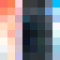
Square Project artwork
Exposure vs Shelter
vulnerability vs strength; exposure_vs_shelter; rising_signal; outside_inward; flood against spark; hard_edges; thin_vs_heavy; tiny_plus; connection_alienation | abstract variation request 344; target batch count 500
- Grid
- 8 x 8
- Cells
- 64
- Colors
- 64
- Record
- b0cba65d
Artist Statement
This piece explores the tension between vulnerability and strength through a palette of warm and cool colors. The hot coral and blood orange radiate a sense of strength, while the dust pink and hollow blue introduce vulnerability. The central area, dominated by pale colors, symbolizes exposure, with the heavier, darker shades at the edges providing shelter and definition. Contrasts between dense clusters and quiet spaces create visual disruption, echoing the emotional themes of the seed. The edges are softened, with broken pixels adding an element of imperfection, reinforcing the themes of exposure and the intricate interplay of human emotions.