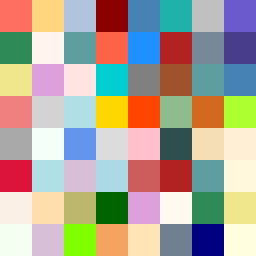
Square Project artwork
Exposure vs Shelter
vulnerability vs strength; light_vs_weight; mirror_broken; sweep; constellation against tide; closed_corners; thin_vs_heavy; horizon; safety_exposure | abstract variation request 100; target batch count 500
- Grid
- 8 x 8
- Cells
- 64
- Colors
- 55
- Record
- af08da75
Artist Statement
This composition explores the tension between vulnerability and strength, reflected in the contrasting use of colors. The palette features warm coral and soft amber to symbolize vulnerability, countered by the cold slate and blue-black, which evoke strength. The main collision occurs diagonally from the top left to the bottom right corner, where warm tones invade cooler spaces, creating an emotional interplay. The broken pixels intentionally disrupt the flow, akin to life's unpredictable nature, suggesting areas of vulnerability amidst comforting strength.