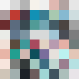
Square Project artwork
Exposure vs Shelter
vulnerability vs strength; light_vs_weight; mirror_broken; sweep; constellation against tide; closed_corners; thin_vs_heavy; horizon; safety_exposure | abstract variation request 491; target batch count 500
- Grid
- 8 x 8
- Cells
- 64
- Colors
- 63
- Record
- aeda58d0
Artist Statement
The emotional tone oscillates between vulnerability and strength, explored through contrasting soft hues and dark anchors. The selected palette - off white, dust gray, compressed red, dark navy, and faint peach - conveys a sense of quiet tension and delicate strength. The collision occurs at the center where the dense spark pattern struggles against the thin threads, representing the fragile boundary between protection and exposure. This layout, 'argument_grid', visually embodies an ongoing dialogue between these emotions without depicting literal imagery.