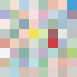
Square Project artwork
Exposure vs Shelter
safety vs exposure; pressure_vs_release; split_vertical; echo_right; braid against ripple; pressure_border; thin_vs_heavy; vessel; softness_severity | abstract variation request 317; target batch count 500
- Grid
- 8 x 8
- Cells
- 64
- Colors
- 64
- Record
- aecaabcd
Artist Statement
The emotional tone reflects the delicate balance between safety and exposure. The chosen palette of 'shelter_green,' 'warm_brown,' 'pale_skin,' 'cold_white,' and 'open_blue' conveys warmth and vulnerability, establishing a contrast where softer shades suggest safety while harsher colors represent exposure. The main collision occurs towards the top left corner, where the pressure of darker, rich colors clashes with the lighter, more delicate tones, creating a point of tension. This pattern evokes a sense of conflict and resolution between contrasting emotions, guided by the seed's themes of protection versus vulnerability.