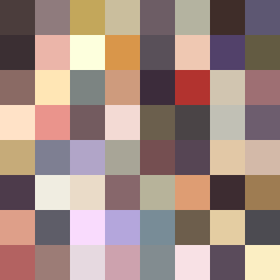
Square Project artwork
Exposure vs Shelter
vulnerability vs strength; light_vs_weight; mirror_broken; sweep; constellation against tide; closed_corners; thin_vs_heavy; horizon; safety_exposure | abstract variation request 473; target batch count 500
- Grid
- 8 x 8
- Cells
- 64
- Colors
- 64
- Record
- ae0c9b55
Artist Statement
This artwork encapsulates the emotional dialogue between vulnerability and strength. Utilizing a palette of warm and muted tones, colors like muted cream contrast against heavy blackened plum and iron gray. The central area features a light reflective quality, symbolizing exposure, while the outer sections envelop it with denser hues, creating a sense of protection. The flow from left to right accentuates movement, with a broken layout reflecting imperfections and the need for safety amid exposure. The intentional disruptions mimic scars, emphasizing the tension of vulnerability amidst strength.