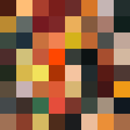
Square Project artwork
Exposure vs Shelter
vulnerability vs strength; symmetry_vs_break; cross_current; braid; flood against stack; pressure_border; fast_vs_slow; tiny_face; desire_emptiness | abstract variation request 233; target batch count 500
- Grid
- 8 x 8
- Cells
- 64
- Colors
- 64
- Record
- abfb454e
Artist Statement
This artwork embodies the emotional dichotomy of vulnerability and strength through an interplay of density and negative space. The palette, composed of burnt orange, dark red, charcoal, and gold, reflects the intensity of these emotions—red expressing strength and orange vulnerability. The layout emphasizes a central bright cluster (the exposed center) amidst darker shades, symbolizing the tension between safety and exposure. The patterns of rings (strength) and noise (vulnerability) collide predominantly in the center, where the emotional contrast is most pronounced. Broken pixels add a sense of imperfection and memory, evoking how desires can juxtapose against emptiness in our lives. This creates an abstract narrative of resilience amid fragility.