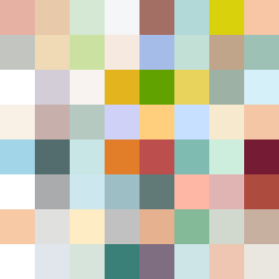
Square Project artwork
Exposure vs Shelter
safety vs exposure; pressure_vs_release; split_vertical; echo_right; braid against ripple; pressure_border; thin_vs_heavy; vessel; softness_severity | abstract variation request 423; target batch count 500
- Grid
- 8 x 8
- Cells
- 64
- Colors
- 62
- Record
- aba5809d
Artist Statement
This piece represents the emotional tension between safety and exposure, reflecting on the gentle weight of protection versus the bright vulnerability of being open. The palette, featuring soft greens and warm browns, symbolizes safety, while the pale skin tones and cold whites evoke exposure. The contrast between these colors serves to create an echoing tension, with the centered soft tones representing vulnerability surrounded by a heavier border of safety. Broken pixels are strategically placed to inject imperfection and disruption, embodying the struggle between the two emotions.