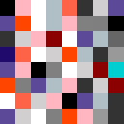
Square Project artwork
Contrast of Emotions
softness vs severity; signal_vs_noise; open_gate; spiral_counterclockwise; pulse_marks against radial; bottom_weighted; light_vs_dark; tiny_plus; guilt_forgiveness | abstract variation request 456; target batch count 500
- Grid
- 8 x 8
- Cells
- 64
- Colors
- 16
- Record
- ab41c029
Artist Statement
This artwork explores the nuanced relationship between softness and severity, creating a dialogue through colors and pattern placement. The chosen palette of powder pink, warm white, carbon black, steel gray, and sharp crimson reflects the emotional spectrum from gentle to harsh. The predominant dark tones create a weighted base, representing severity, while bright accents and softer hues intermittently break through, portraying moments of softness and forgiveness. The central collision occurs around the core with dark backgrounds contrasting sharply against vivid colors, representing the tension of emotion shifts, echoing the thematic spiral and pulse described in the seed.