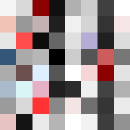
Square Project artwork
Exposure vs Shelter
vulnerability vs strength; light_vs_weight; mirror_broken; sweep; constellation against tide; closed_corners; thin_vs_heavy; horizon; safety_exposure | abstract variation request 362; target batch count 500
- Grid
- 8 x 8
- Cells
- 64
- Colors
- 59
- Record
- aafaa18e
Artist Statement
The emotional tone encapsulates a delicate balance of vulnerability and strength, represented through contrasting colors and placements. The palette features muted tones like off-white and dust gray alongside compressed red and dark navy, highlighting the tension between open exposure and protective strength. The main collision occurs in the center where rippled patterns of vulnerability confront the shattering intensity of strength, creating a dynamic interplay of light and density. Negative space is strategically left to signify moments of quiet amidst the chaos, echoing the themes of the seed: safety in exposure and the fragility of strength.