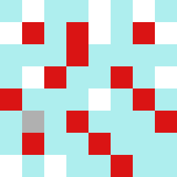
Square Project artwork
Contrasting Forces
vulnerability vs strength; exposure_vs_shelter; rising_signal; outside_inward; flood against spark; hard_edges; thin_vs_heavy; tiny_plus; connection_alienation | abstract variation request 293; target batch count 500
- Grid
- 8 x 8
- Cells
- 64
- Colors
- 4
- Record
- a7bc8adb
Artist Statement
This artwork embodies the emotional dichotomy of vulnerability and strength through color. The palette of pale aqua and mist gray suggests a serene foundation, while alarm red provides an urgent spark, creating tension against a backdrop of ink blue and clear white. The main contrast occurs at the center, where the 'veil' of strength clashes with the 'dots' of vulnerability, interrupted by the jagged edges that reflect moments of exposure. This composition illustrates the complex interaction between openness and protection, evoking feelings of both tension and harmony.