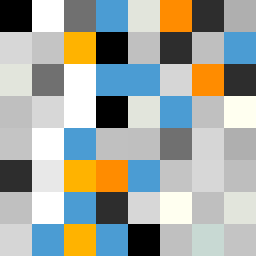
Square Project artwork
Fractured Balance
vulnerability vs strength; light_vs_weight; mirror_broken; sweep; constellation against tide; closed_corners; thin_vs_heavy; horizon; safety_exposure | abstract variation request 53; target batch count 500
- Grid
- 8 x 8
- Cells
- 64
- Colors
- 18
- Record
- a65463ed
Artist Statement
This piece embodies the conflict between vulnerability and strength, using color to portray emotional tension. The palette consists of clean white and ice blue to represent clarity and fragile hope, while violet gray and warning orange evoke a sense of urgency and exposure. The main contrast occurs at the center, where a dense cluster of dark colors spills over lighter fields, illustrating the struggle between stability and exposure. The 'tiny_cross' shape seed is interpreted through patchwork and embers, resulting in a layout of scattered repair and bursts of light amid dark patches, reflecting the ongoing tension of brokenness and safety.