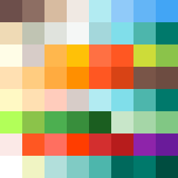
Square Project artwork
Exposure vs Shelter
safety vs exposure; pressure_vs_release; split_vertical; echo_right; braid against ripple; pressure_border; thin_vs_heavy; vessel; softness_severity | abstract variation request 190; target batch count 500
- Grid
- 8 x 8
- Cells
- 64
- Colors
- 53
- Record
- a5f01c45
Artist Statement
The artwork captures the tension between vulnerability and protection, using a palette that contrasts warm and cool tones. The left side represents safety with soft browns and greens, creating a warm enclosure, while the right side uses pale blues and whites to reflect brightness and exposure. The arrangement echoes a central collision point that radiates emotional tension, signifying the interplay between pressure and release. The split vertical layout emphasizes this duality, and the addition of broken pixels introduces intentional disruptions, enhancing the narrative of imperfection and complexity.