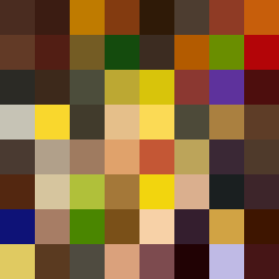
Square Project artwork
Tension of Opposites
vulnerability vs strength; symmetry_vs_break; cross_current; braid; flood against stack; pressure_border; fast_vs_slow; tiny_face; desire_emptiness | abstract variation request 295; target batch count 500
- Grid
- 8 x 8
- Cells
- 64
- Colors
- 64
- Record
- a4496cef
Artist Statement
The composition captures the emotional tone of vulnerability contrasted with strength. The chosen palette of burnt orange, dark red, charcoal, and gold evokes warmth while highlighting the pain and pressure associated with vulnerability. The lattice pattern interspersed with the frame showcases a break in symmetry, reflecting the clash of emotions where the center represents strength supported by a protective frame, while the surrounding lattice conveys fragility. The collision of dark and light colors in the center tightens this narrative, visually representing a pressure border and an echo of robustness against the softer tones. The placement of broken pixels introduces intentional disruptions that symbolize the conflict and duality in our experiences.