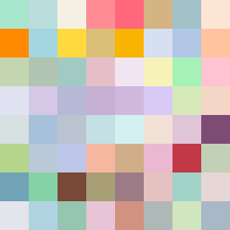
Square Project artwork
Collision of Opposites
vulnerability vs strength; light_vs_weight; mirror_broken; sweep; constellation against tide; closed_corners; thin_vs_heavy; horizon; safety_exposure | abstract variation request 431; target batch count 500
- Grid
- 8 x 8
- Cells
- 64
- Colors
- 64
- Record
- 9fddfe03
Artist Statement
The emotional tone of this piece reflects a tension between vulnerability and strength. The palette of shelter green, warm brown, pale skin, cold white, and open blue creates an interplay between warmth and coolness, mirroring the dichotomy of lightness versus weight. The main collision occurs diagonally, with strength in the lower left using broken dots creating a dense foundation against the softer, sparser spark pattern in the upper right. The arrangement echoes the ideas of closed corners and the horizon, suggesting both safety and exposure. Negative space is preserved in the upper zone to symbolize vulnerability, letting the palette breathe and create a dynamic visual tension.