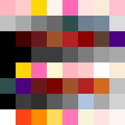
Square Project artwork
Balance in Conflict
softness vs severity; signal_vs_noise; open_gate; spiral_counterclockwise; pulse_marks against radial; bottom_weighted; light_vs_dark; tiny_plus; guilt_forgiveness | abstract variation request 285; target batch count 500
- Grid
- 8 x 8
- Cells
- 64
- Colors
- 40
- Record
- 9f7202ff
Artist Statement
The emotional tone centers on the duality of softness and severity, represented through a palette that juxtaposes gentle pinks with deep blacks and striking reds. The top half carries soft colors that create an upward movement, resonating with the softness, while the bottom half employs darker hues to establish weight and severity. Here, black and crimson create sharp contrasts against warm whites and powder pinks, illustrating a tension that lies between openness and confinement. This collision is neutralized through the use of negative space, allowing for moments of quiet amidst intensity. The spiral influence is suggested through the organized chaos of colors that draw the eye outwards from the center.