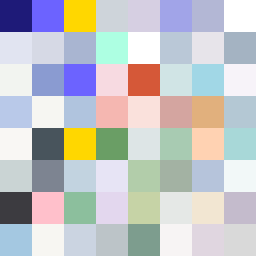
Square Project artwork
Exposure vs Shelter
vulnerability vs strength; symmetry_vs_break; cross_current; braid; flood against stack; pressure_border; fast_vs_slow; tiny_face; desire_emptiness | abstract variation request 406; target batch count 500
- Grid
- 8 x 8
- Cells
- 64
- Colors
- 61
- Record
- 9f55bcfb
Artist Statement
The emotional tone reflects a contrast between the vulnerable exposure at the center and the protective strength offered by the surrounding colors. The chosen palette of melancholy wonder, with blues and soft grays, captures a sense of quiet conflict. The collision occurs diagonally, where the strength patterns of deep blue and muted plum intersect with the lighter, pressure band colors of soft cyan and moon white. This balance conveys the dynamic tension of vulnerability meeting strength, showcasing a fight between despair and assurance within an abstract composition.