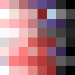
Square Project artwork
Light vs Weight
awe vs terror; order_vs_chaos; center_seed; wave_vertical; split_screen against broken_dots; soft_edges; stable_vs_unstable; tiny_plus; broken_memory | abstract variation request 112; target batch count 200
- Grid
- 8 x 8
- Cells
- 64
- Colors
- 51
- Record
- 9ee4a6cc
Artist Statement
The emotional tone juxtaposes awe and terror, creating a tension between lightness and heaviness. The chosen palette, rooted in shades of pink, red, gray, and dark maroon, symbolizes the warmth of awe against the gravity of terror. The contrast emerges in the arrangement, with lighter colors positioned to the center contrasting against the darker edges, embodying a split-screen effect. Each color subtly bleeds into the others, representing memory and instability, while respecting a necessary negative space, invoking an emotional echo. The composition encourages the viewer to navigate the feelings of the light and the weight, evoking a sense of both comfort and unease.