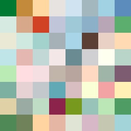
Square Project artwork
Exposure vs Shelter
safety vs exposure; pressure_vs_release; split_vertical; echo_right; braid against ripple; pressure_border; thin_vs_heavy; vessel; softness_severity | abstract variation request 147; target batch count 500
- Grid
- 8 x 8
- Cells
- 64
- Colors
- 64
- Record
- 9dd7ecda
Artist Statement
The emotional tone of this artwork reflects the tension between safety and exposure. A warm palette of 'shelter_green' and 'warm_brown' provides a comforting frame, promoting feelings of safety, while the inclusion of 'cold_white' and 'open_blue' suggests vulnerability and exposure. The main contrast occurs at the center where these tones collide, establishing a dynamic interplay between protection and openness. The pattern alternates between dense clusters and quiet fields, signifying the push and pull of pressure versus release. Broken pixels are scattered throughout, adding intentional disruptions to the otherwise stable layout, thus enhancing the sense of emotional complexity.