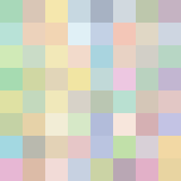
Square Project artwork
Exposure vs Shelter
safety vs exposure; pressure_vs_release; split_vertical; echo_right; braid against ripple; pressure_border; thin_vs_heavy; vessel; softness_severity | abstract variation request 238; target batch count 500
- Grid
- 8 x 8
- Cells
- 64
- Colors
- 64
- Record
- 9d289508
Artist Statement
This composition reflects the emotional tension between safety and exposure through a carefully chosen color palette and layout. The predominant use of gentle greens and soft browns creates a sense of shelter, while pale skin tones and open blues suggest vulnerability and exposure. The falling pixel layout facilitates a slow descent of colors, echoing the conflicting feelings of pressure and release. The dominant hue resides in the central column, where safety meets exposure, visually illustrated by alternating patterns of softer ('teeth') and sharper ('halo') forms, creating a gentle clash that embodies the seed's essence. Broken pixels introduce an element of imperfection, enhancing the emotional narrative without becoming literal representations.