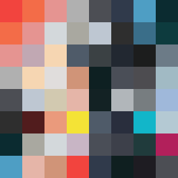
Square Project artwork
Contrasting Fortitude
vulnerability vs strength; exposure_vs_shelter; rising_signal; outside_inward; flood against spark; hard_edges; thin_vs_heavy; tiny_plus; connection_alienation | abstract variation request 142; target batch count 500
- Grid
- 8 x 8
- Cells
- 64
- Colors
- 45
- Record
- 9b20ce4b
Artist Statement
The emotional tone in this composition reflects a tension between vulnerability and strength. The selected palette of 'desire_emptiness' presents hot hues like blood orange and coral against grounding shades of charcoal and hollow blue, depicting the clash of warmth and coolness typical of inner struggles. The main collision occurs at the center where a dense checker pattern of vulnerability meets a bold channel of strength, representing the exposure against protection. Broken pixels add a layer of imperfection, suggesting scars of experience, while the negative space provides a moment of quiet reflection. This captures the essence of striving for balance between fragility and resilience.