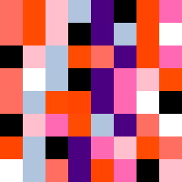
Square Project artwork
Exposure vs Shelter
vulnerability vs strength; symmetry_vs_break; cross_current; braid; flood against stack; pressure_border; fast_vs_slow; tiny_face; desire_emptiness | abstract variation request 204; target batch count 500
- Grid
- 8 x 8
- Cells
- 64
- Colors
- 9
- Record
- 9b02ac62
Artist Statement
This artwork explores the emotional tension between vulnerability and strength through contrasting palettes and arrangements. The warm hues of hot coral and blood orange suggest energy and resilience, while the cooler shades of hollow blue and charcoal provide a sense of calm and introspection. The collision of the soft dot pattern representing vulnerability with the fault line structure of strength creates a cinematic conflict that captures the essence of exposure in a protective space. The primary contrast is found in the center, where the colors merge and interact, embodying the push-pull dynamic of the seed's themes.