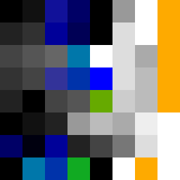
Square Project artwork
Exposure vs Shelter
vulnerability vs strength; light_vs_weight; mirror_broken; sweep; constellation against tide; closed_corners; thin_vs_heavy; horizon; safety_exposure | abstract variation request 153; target batch count 500
- Grid
- 8 x 8
- Cells
- 64
- Colors
- 29
- Record
- 9a1371c4
Artist Statement
The emotional tone captures the delicate balance between strength and vulnerability. The palette of clean white, ice blue, ink black, violet gray, and warning orange highlights this contrast, with cool blues representing vulnerability and warm oranges for strength. The layout showcases a central bright cluster that represents resilience amidst a dim surrounding, suggesting an active vibrance against a backdrop of uncertainty. Broken pixels add intentional imperfections to signify scars and interruptions, enhancing the emotional depth. The main collision occurs at the center, where distinct patterns of veil and ash field interact, symbolizing the struggle between exposure and protection.