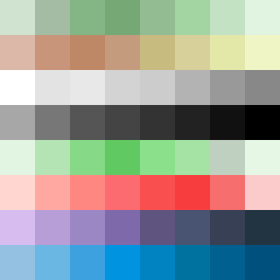
Square Project artwork
Exposure vs Shelter
safety vs exposure; pressure_vs_release; split_vertical; echo_right; braid against ripple; pressure_border; thin_vs_heavy; vessel; softness_severity | abstract variation request 195; target batch count 500
- Grid
- 8 x 8
- Cells
- 64
- Colors
- 64
- Record
- 995f710f
Artist Statement
The emotional tone revolves around the contrasting themes of safety and exposure. The chosen palette includes soft, comforting greens and browns to represent safety, juxtaposed against pale colors indicative of vulnerability. The main tension lies within the central spiraled pattern, with the cooler colors representing exposure swirling around warmer, stabilizing hues that convey safety. This creates a visual echo effect that symbolizes the push and pull between shelter and vulnerability. The layout of colors suggests a gentle spiral of pressure emanating from the center, representing the tension and conflict of emotions without forming any recognizable shapes or patterns.