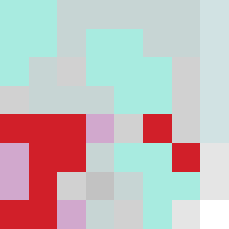
Square Project artwork
Center Pulse
vulnerability vs strength; exposure_vs_shelter; rising_signal; outside_inward; flood against spark; hard_edges; thin_vs_heavy; tiny_plus; connection_alienation | abstract variation request 114; target batch count 500
- Grid
- 8 x 8
- Cells
- 64
- Colors
- 9
- Record
- 989060f3
Artist Statement
This artwork captures the tension between vulnerability and strength through contrasting color placed in a split layout. The left side is infused with soft hues of pale aqua and mist gray, suggesting a sense of exposure and fragility. In contrast, the right side uses the intensity of alarm red and ink blue to represent strength and resilience. The dominant color of pale aqua creates a serene environment, while the clear white acts as a quiet field, amplifying the other colors. The central collision occurs between the cool and warm colors, emphasizing the notion of 'rising signal.' Patterns of ladders on the left evoke a sense of vulnerability, while static blocks on the right signify strength and stability. Broken pixels exist as imperfections to narrate the story of resilience through fractures, inviting reflection on the harmony between chaos and order.