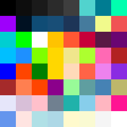
Square Project artwork
Exposure vs Shelter
vulnerability vs strength; light_vs_weight; mirror_broken; sweep; constellation against tide; closed_corners; thin_vs_heavy; horizon; safety_exposure | abstract variation request 115; target batch count 500
- Grid
- 8 x 8
- Cells
- 64
- Colors
- 61
- Record
- 97d9259a
Artist Statement
The emotional tone reflects a tension between vulnerability and strength. The palette combines deep black with vibrant electric blue, magenta, and bright lime, creating a contrast between a dense, protected core and lighter, exposed outer edges. This highlights the collision between safety and exposure at the center of the square, enhanced by broken pixels suggesting the imperfections of vulnerability. The pattern of 'islands' for vulnerability creates delicate patches within bolder, thicker 'spark' elements that represent strength, capturing the essence of emotional duality.