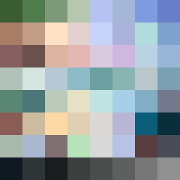
Square Project artwork
Exposure vs Shelter
safety vs exposure; pressure_vs_release; split_vertical; echo_right; braid against ripple; pressure_border; thin_vs_heavy; vessel; softness_severity | abstract variation request 91; target batch count 500
- Grid
- 8 x 8
- Cells
- 64
- Colors
- 64
- Record
- 97cb4b77
Artist Statement
This composition explores the emotional tension between safety and exposure. The left side is dominated by a warm brown and shelter green palette evoking comfort and protection, while the right side features open blue and pale skin hues, suggesting vulnerability and openness. The use of a split vertical layout reflects the theme of dichotomy, with the main collision occurring at the center where the warm barrier meets the cool exposure. Broken pixels introduce a sense of imperfection, symbolizing the fragility of this balance. The echo effect of patterns from left to right emphasizes the ongoing interaction of these opposing forces, maintaining visual interest while respecting the emotional core of the piece.