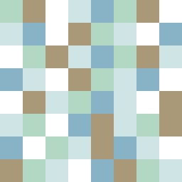
Square Project artwork
Fragile Shelter
safety vs exposure; pressure_vs_release; split_vertical; echo_right; braid against ripple; pressure_border; thin_vs_heavy; vessel; softness_severity | abstract variation request 201; target batch count 500
- Grid
- 8 x 8
- Cells
- 64
- Colors
- 5
- Record
- 97175274
Artist Statement
The emotional tone encapsulates the tension between vulnerability (exposure) and protection (safety). The palette of soft greens, warm browns, and pale hues evokes a sense of shelter while contrasting sharply with the cold white and open blue that signify exposure. The main contrast occurs at the center where the pale skin color is interjected with vibrant accents from the warm brown and open blue, presenting an interruption that echoes the concept of split verticality. This creates tension in the composition, drawing attention to how the safe spaces interact with exposed brightness, reflecting both a physical and emotional landscape of safety and vulnerability.