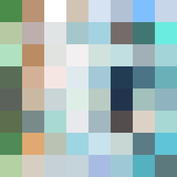
Square Project artwork
Exposure Sheltered
safety vs exposure; pressure_vs_release; split_vertical; echo_right; braid against ripple; pressure_border; thin_vs_heavy; vessel; softness_severity | abstract variation request 136; target batch count 500
- Grid
- 8 x 8
- Cells
- 64
- Colors
- 64
- Record
- 96baaba8
Artist Statement
This piece conveys a duality of safety and exposure, illustrated through the color arrangement and emotional contrasts. The palette consists of muted, warm colors (shelter_green, warm_brown) interspersed with cooler, stark tones (cold_white, open_blue) to represent the tension between vulnerability and protection. The composition features thick, dark borders representing safety juxtaposed with lighter, more intricate patterns of pale and cold colors that infuse a sense of exposure. The main collision occurs in the center, where darker, more stable colors encroach upon lighter, more chaotic hues like ripples against a safe shore, creating a narrative of tension and interaction between 'islands' of safety and a 'constellation' of exposure.