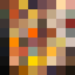
Square Project artwork
Tension of Opposites
vulnerability vs strength; exposure_vs_shelter; rising_signal; outside_inward; flood against spark; hard_edges; thin_vs_heavy; tiny_plus; connection_alienation | abstract variation request 248; target batch count 500
- Grid
- 8 x 8
- Cells
- 64
- Colors
- 63
- Record
- 964ec79b
Artist Statement
The artwork embodies the emotional tension between vulnerability and strength, using a palette of burnt orange, dark red, charcoal, and gold—colors that evoke warmth and intensity versus muted calm. The patterns reflect vulnerability through soft halos and strength through rigid, stair-like formations. The primary collision is centered, where the warmth of burnt orange interacts with the dark red, representing exposure meeting shelter, creating a compelling contrast that captures the dynamic interplay of emotions. The use of broken pixels introduces intentional imperfections, enhancing the feeling of fragility amidst strength.