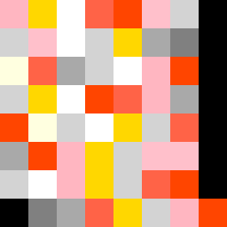
Square Project artwork
Contrast in Motion
softness vs severity; signal_vs_noise; open_gate; spiral_counterclockwise; pulse_marks against radial; bottom_weighted; light_vs_dark; tiny_plus; guilt_forgiveness | abstract variation request 154; target batch count 500
- Grid
- 8 x 8
- Cells
- 64
- Colors
- 11
- Record
- 9135450b
Artist Statement
This abstract piece captures the dichotomy of softness versus severity through a carefully chosen palette of soft and sharp colors, reflecting emotional tension. The warmer tones of powder pink and warm white represent softness, while carbon black and sharp crimson express severity. The arrangement introduces a spiral flow that highlights the push and pull between these emotional states, with intensity concentrated toward the center to symbolize struggle, while lighter hues provide a counterbalance. Key contrasts appear as radial pulses at the core that disrupt the outer channels, echoing feelings of guilt and forgiveness, culminating in a visual narrative of tension between refuge and exposure.