Square Project artwork
Exposure vs Shelter
vulnerability vs strength; light_vs_weight; mirror_broken; sweep; constellation against tide; closed_corners; thin_vs_heavy; horizon; safety_exposure | abstract variation request 375; target batch count 500
- Grid
- 8 x 8
- Cells
- 64
- Colors
- 46
- Record
- 9028ca0d
Artist Statement
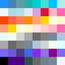
This composition contrasts vulnerability and strength through the use of color density and pattern. The top rows reflect 'strength' with a stack pattern of deeper colors, suggesting a solid foundation, embodying strength and resilience. The bottom rows introduce 'vulnerability' with a dot pattern in lighter tones that evoke fragility and an exposed nature. The emotional palette combines pale aqua and mist gray to create serenity, while alarm red serves as an accent for urgency. The collision between strong, deep colors and lighter, softer ones creates a tension that mirrors the thematic interplay of exposure and safety. The broken pixels are intentionally placed to enhance the sense of interruption, adding scars to a seemingly stable structure. Overall, the grid captures the delicate balance between protection and exposure, establishing an abstract emotional narrative.