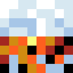
Square Project artwork
Order vs Chaos
restlessness vs peace; memory_vs_motion; diagonal_argument; edge_crawl; flame against shatter; closed_corners; light_vs_dark; patch; signal_noise | abstract variation request 160; target batch count 500
- Grid
- 8 x 8
- Cells
- 64
- Colors
- 8
- Record
- 8fd16d8a
Artist Statement
This artwork embodies the duality between restlessness and peace through its contrasting color arrangements. The palette blends cool tones of ice blue and clean white with darker accents like ink black and violet gray. The top half represents peace with a mirrored, structured arrangement, while the bottom half disrupts this stability with broken frames and wandering markers, suggesting the tension of chaos. The interaction between the two quadrants creates a sense of unresolved motion, highlighted by strategic placements of warmer colors like warning orange, especially in the collision area near the center, marking a vibrant confrontation between order and chaos.