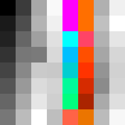
Square Project artwork
Contrast in Motion
restlessness vs peace; memory_vs_motion; diagonal_argument; edge_crawl; flame against shatter; closed_corners; light_vs_dark; patch; signal_noise | abstract variation request 293; target batch count 500
- Grid
- 8 x 8
- Cells
- 64
- Colors
- 56
- Record
- 8c7131de
Artist Statement
The emotional tone explores the push and pull between restlessness and peace, using a palette that combines vibrant, energetic colors with muted tones to represent conflicting states. The dark colors signify deep, restless energy, while the lighter shades suggest calmness and stability. The diagonal patterns reflect motion and tension, while the quiet paths of negative space create moments of tranquility. The interplay between scar patterns and pulse marks visually narrates the struggle between interruption and serenity.